Welcome to “Puzzler”, a short Virtual Reality dungeon adventure puzzle game. You quest, should you choose to accept it, will be to make it through the dungeon and out the other side. Inside the dungeon you find the only way out is by solving a puzzle.
Here is a video showing the game in action
Story of the process
The Idea of Puzzler, how it would play, the scripted orb gameplay, and assets were supplied by Udacity as part of a project with the VR Developer Nanodegree program. It was up to the student to fill in all the other pieces and document the process. To start we developed baseball cards of the target audience. This included a short write up on what we thought our candidates for Puzzler would be.
Persona
What is a game without an audience. Making up an example player helped us define who the player may be. Questions like: “Are they someone who would be interested in our game?”, “Are puzzle games for everyone?”, or “What kind of skill level are we expecting?” all influence the gameplay experience. Knowing your audience is key to making great targeted experiences.
Here we define a player named Gina. She seems to play games on a regular basis and has the flair for some adventure. I think our adventure puzzle game is good first try at VR for someone like her.

Name: Gina
Age: 32
Occupation: Civil service
Quote: “Games are my thing. Lets crush some candy.”
VR Experience: None
Personality: Graceful as the waves made by feathers landing on a calm body of water, but aggressive as the bear that catches salmon in a roaring river. Gina is not easily swayed by wooing ads on milk cartons and won’t let you know she is steps ahead of you. When it come to boasting say it loud and proud because winning is what it’s all about, IN YOUR FACE. You will probably want to make up more “Persona” cards. Only appealing to one audience type is very limiting. Hey you never know it may inspire you with follow up ideas to expand on the Puzzler game series.
Sketches
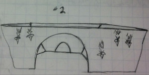
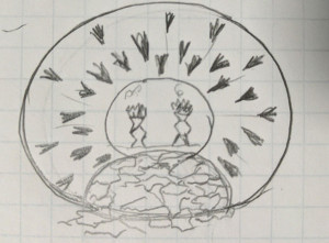
Next came the design of the level itself. These sketches were only to give us a frame of reference for the idea of Puzzler. Putting to paper what we thought the layout of the dungeon and gameplay elements made it easier to take as a visualization into the level buildout process. 1 and 2 are somewhat similar but 3 shows a little deviation with using a round room or tunnel to pass through. Though the final design and assets used were heavily influenced by the instructor it shows that one should try to storyboard multiple ideas of the theme up front. You may find pieces of each end up in the final product.

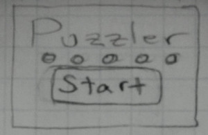
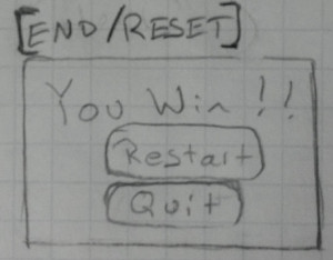
This process was also extended to the user interface elements as well. Here are the start and end UI screens. Not much variation here.
User Testing
No matter how well you can plan, you will never know anything until someone tries it out. That was a consistent theme throughout the build process. Marking a goal to implement some piece then getting it in front of someone as soon as possible to test out helps a lot. While testing ensure you questions are open ended to prevent influencing their thoughts.
Here are some questions I asked their repective user responses and what I found needed to be changed.
- Scale Tests
- Q: What size do you feel like in the scene?
- A: Shorter
- Q: How big do you think you are compared to your normal height?
- A: Feels like I am shorter by 1/8 of orignial height
- Resulted in raising the height of the camera
- Ambiance or mood
- Q: Please describe the mood?
- A: Seems pleasant
- Q: Please describe the lighting?
- A: Looks fine
- Q: Where are you?
- A: Chamber, basement, jail you can’t escape.
- Although there were no complaints and they did understand the astetic look, their excitement seemed low. Adjusted the lighting and added more details to the scene
- Comfort
- Q: Tell me about the VR experience?
- A: Somewhat nauseating
- Went back to adjust the quality settings, lighting, and made sure objects were static.
- Scene
- Q: Can you see everything you want to see?
- A: Yeah, everything is there.
- Q: Does everything look correct?
- A: Grill dosen’t look like it belongs. Looking outside the door you thing you will fall.
- I made sure the grill texture that used on some of the floor tiles was done properly and not as noticable. Also moved the players play position into the building and added some ground outside the entrance.
Breakdown of final piece
This section walks you through each area of the game with descriptions of the final piece as well as their development progression.
The user is taken into a dungeon room and the only way out is for them to ‘Solve the Puzzle’. The user is presented with a set of glowing orbs that emit different tones when interacted with. To solve the puzzle the user must mimic a selection sequence on the orbs that is shown to them when they first enter the room.
They have unlimited tries while in the room and may look around to observe some of the ambiance. After the sequence is complete they are taken out the other side of the room and show the ending screen.
Starting with the intro A user is given a brief intro GUI stating the name and allowing them to start the game. In the background they can faintly see the building with lighting effects and dark sky. These screenshots show the difference adding more light to the scene makes. There is a greater contrast between the user GUI and objects behind.
Intro scene: adjusting the lighting adds more contrast
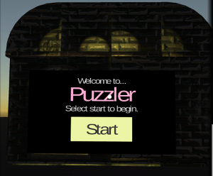
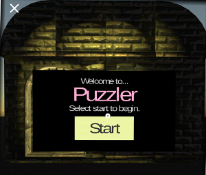
After clicking start the user is moved into the dungeon where the main gameplay takes place. Here I improved the overall aesthetic of the building by adding a torch and lighting to the outside of the door way. This makes the building look more realistic and adds some character to the scene.
Moving into the Doorway, Torch is more realistic
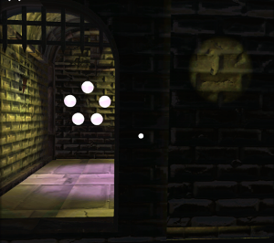
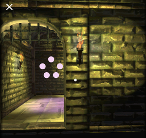
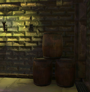
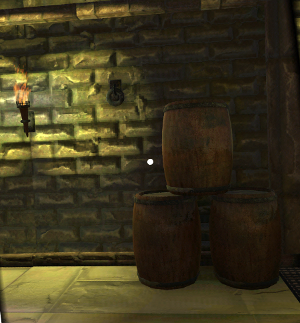
Inside of the building there are some items around including torches for lighting and barrels that may have been left behind by whomever. Here we adjust lighting and add a flame to the torch. Something as simple as the flame makes the lighting seem more realistic and to be emanating from a source.
Barrels with a more realistic torch for lighting.
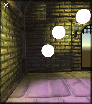
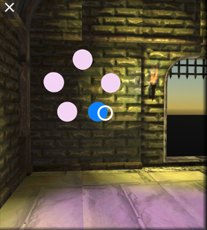
Here is where the actual gameplay takes place. The user is shown a series of orbs that light up and emit different tones. A sequence involving the orbs is shown to the user and they must mimic it to “win” the game. Here we show the evolution of placement and color options that the orbs took during the development process. After entering the correct sequence the user is taken out of the room and shown a end GUI screen similar to the beginning GUI.
Movement of Orbs to the Wall
You may download the android apk here PUZZLER android apk
Conclusion
In all it was a fun to go through the full process of an application development cycle. You were exposed to the many steps and details that go into a project. Though some novel and some repetitive all are important.
I had lot’s of fun making Puzzler. This Udacity lesson was a real eye opener to the amount of time that can be put into all the details of a piece. I also developed an understanding of where my strengths and weaknesses were as well as what my standards are, which we must all understand nothing can be perfect. Everyone should get into the habit of documenting their work, not only to keep record for others but also to make sure you have the lessons learned for yourself.
Take aways
- Have an Idea of who you are developing for.
- Brainstorm and Sketch out as many ideas as possible.
- Storyboard your ideas.
- Test and observe often, user feedback is key, then test again.
- Document everything you learned. Others may learn as well.
Next Steps
From here we have a very good starting point but there are some enhancements and imporovements to be made.
Scene Elements
Adding some other scene elements such as terrain, fog, and other decorations within the structure.
More Play Area
Create other rooms for the player to enter and interact with different types of puzzles. Perhaps a moving block puzzle or exchange the orbs with crystal meshes.
Orbs
For now it seems a little confusing to have the orb make noise on mouse over and also when it gets selected. Will perform some experiments removing the on mouse over action.
Link to additional work
Check back on my web site for future work.
TheGreatPissant.com
-Jim