This Udacity VR Showcase project is a sample of what education may look like in VR. The student is given stations that introduce a lesson concept and reinforce it through interaction, somewhat like a museum exhibit. VR is allowing for the gamification of education in exciting ways.
Story of the process
You don’t have an appreciation of how much time goes into that last 10% of any project until you must complete it yourself. At first the scope of what I wanted to accomplish did not seem to daunting. I eventually spent many more hours on this then I thought I would. Some were for things that ultimately did not fit into the final product.
BTW this is a continuation of my work with the Udacity Nano degree.
Persona
The intended end-user of this project is a student, any skill level, someone that is in the position of learning through lecture. Knowing the end-user helps define some of the requirements the VR application must support. Attention needs to be maintained, and VR would allow for engagement that helps keep that attention. Retention comes from reinforcement of lessons and the ability to take notes that rekindle memories of those lessons.
These takeaways are what influenced the design of this project. VR allows us to take lessons beyond observance experiences, utilize virtual space to create memories, and take advantage of its virtual representation of physical space.
First, I wanted to allow the student to take notes. Instead of making it a tradition paper notebook, let’s take advantage of virtual space and digital assets. Next, there needed to be a way to reinforce the lesson, allow the user to get their virtual hands dirty, and interact with the experiences playing with the virtual props themselves.
Design
With the user requirements set, its time to lay out some design ideas. In the spirit of the work and to be a little self-serving I picked the theme of game design. As this is just an example, I wanted to keep the lesson information light, 5 - 7 minutes max to through the whole thing.
The field notebook was too complicated for the cardboard platform in this application. Originally the user had an interface to the notebook that would show them the lessons they had interacted with and what the user saved. The save functionality was kept but moved directly to the station interfaces with saved user-created objects placed in the mind palace.

Originally each station was envisioned as a diorama on a pedestal with which the user could interact. From this to the final product you can see the idea changed drastically. In this case, the affordances design was restricted and overcomplicated.
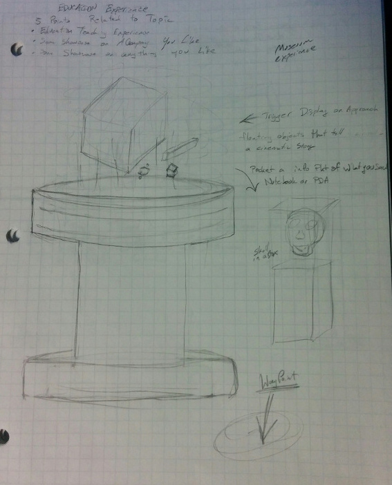
I had implemented pedestals for each station. Eventually, I removed them from the final design.

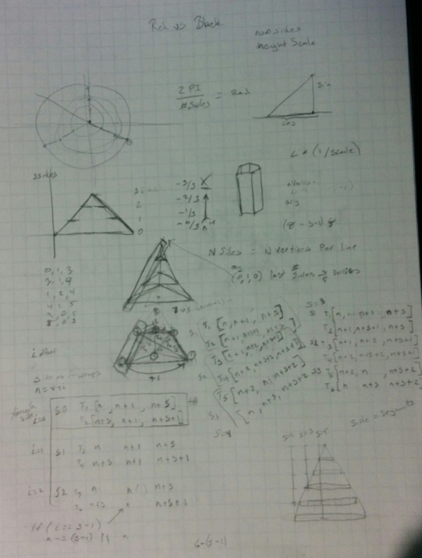
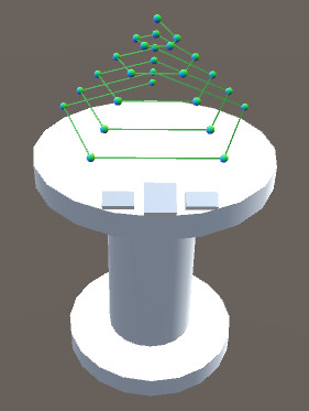
Sometimes you must ask yourself if the idea is just an exercise in your abilities. What I mean by that is in the original version of the meshes station, I was going to show a full pyramid of vertices the student could choose. The design turned out to be complicated, and just an idea I hung on to prove that I could figure it out. The final video shows a more effective design choice using a rotating cube.
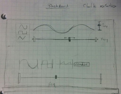
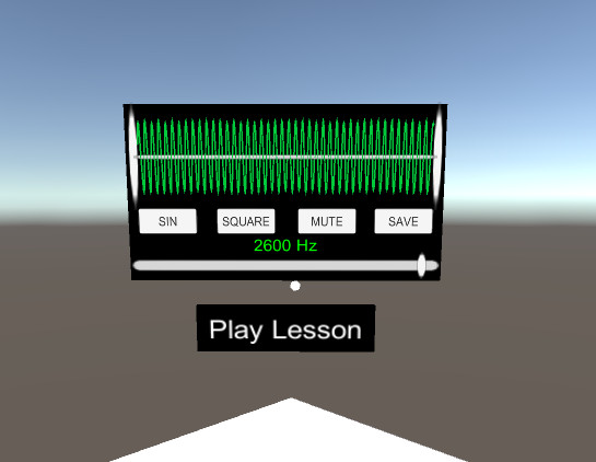
The least changed was the sound station.
User Testing
Aside from the user testing feedback to the questions that I asked in line with my last project, see my write up on Puzzler, I also received feedback that drastically changed the design of the color station and mesh station. What I thought would be cool was not necessarily the most effective.
The user had preconceived notions based on past experiences of physical interactions with objects in the real world. When the user would interact with the lesson stations, those ingrained interactions did not translate to my designs. This meant the model for interacting with the lessons would need to adaption to those expectations users may have. Otherwise, redesign each lesson in a way that was more intuitive to the user. Sticking with familiar and already learned elements of control like sliders and buttons, I was able to guide the user through a lesson. I also found providing a short animation involving the station controls with a voice track helped as well.
The color station is what brought about this realization that the stations may be too complicated. The person having learned the gaze pointer went to select the lights themselves and ignore the panel in front of them, which is understandable. They had the instinct to reach out and touch the lights to manipulate them.
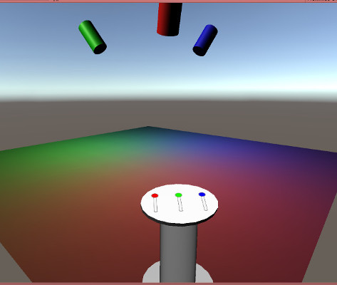
In VR, we can interact with objects directly, bringing you closer to the lesson material. I was trying to force them to pay attention to an interface on the pedestal when they want to manipulate the light. They are supposed to get good at the lesson material, not interfaces.
Here the interface is simplified, and the lesson material presentation is within your field of view.
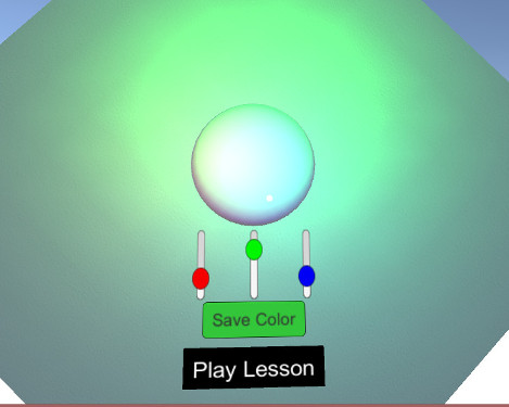
Self-administered testing is not easy to get right, but I think I’m getting a better feel for it. This project meant focusing on input decisions and taxing users’ cognitive abilities. Each type of input system has its own set of designing considerations. This project utilized just a single touch input with gaze pointer on the screen. Input required simple yet effective interactions that did not require too much head movement, making them comfortable to look around and get feedback to within the users FOV.
Conclusion
Don’t be afraid to cut things out of your final product. It may make it a better piece in the end. If I had included the full notebook I originally wanted too, the user would have been overwhelmed and lost. Just because you think it’s cool doesn’t mean its practical.
Familiar spaces and the way you approach them is not the same as the other person. No two people will run through nonlinear workflows the same. Teaching the user a new workflow requires breaking the nonlinear system into small linear scenarios using learned interactions and build up to the more complicated ones. Guide them through and to the end goal.
Education in VR has promise. It also needs to be thoroughly user-tested at each stage of development. If application design is appropriately considered, platform and content will not be limiting factors to blame for a miserable experience. Showcasing the color and mesh lessons still came across the way I wanted to in their material. It was the interface design that needed to be considered for the platform. The proof was that this platform could make an engaging and memorable experience to learn the material.
Takeaways
- The last 10% is the hardest part. You’ve got to finish!!
- Don’t be afraid to cut.
- Test with people not afraid to criticize your work
- Make sure your implementation is simple and not something that is just scratching your technical itch. Don’t complicate things
- Redesign with a fresh approach.
- Write about your work.
Link to additional work
Check back on my web site for future work.
TheGreatPissant.com
-Jim